
60% of SMBs that make data-driven decisions financially outperform their less data-driven counterparts. But collecting survey responses is only half the battle. You still need to know how to analyze them.
The right survey analysis tool depends on the data you’re working with, how much analysis you need, and who will be using the insights.
Below, we cover what survey data analysis is, why it matters, different ways to analyze feedback, some tools to use, and a few best practices to help you get the most out of every survey you send.
What is survey data analysis?
Survey data analysis is the process of identifying patterns, trends, and statistically significant numbers in customer feedback so you can improve a product or service.
It works across two kinds of data at once. Quantitative data is the countable stuff: ratings, net promoter score (NPS), CSAT, and multiple-choice answers. Qualitative data is everything customers write in their own words.
The goal isn’t the number on its own. It’s the motivation behind it, the why that explains the score. Get that right and what you learn feeds straight into better products, a smoother post-purchase experience, sharper marketing, and faster customer support.
Why analyze survey data?
Surveys don’t end when you hit send. The real payoff comes when you dig into the responses, pull them apart, and connect them to what’s happening in your business. Here’s what that work gets you.
You understand customer behavior, from intentions to preferences. Well-designed experiences are built on how customers actually think. When reaching a goal feels straightforward, whether that’s buying, signing up, or researching, customers stick around. When it feels slow and redundant, they leave. The stakes are real: 51% of customers cut spending with a brand after a very poor experience, according to Qualtrics.
You measure satisfaction with real specificity. What do customers love? What could they drop without noticing? A feature your team assumes is unnecessary might be the exact thing customers keep coming back for. Knowing what satisfies and what doesn’t is how you build stronger experiences instead of guessing at them.
You validate hypotheses. You made a change. Was it the right call? Survey data tells you whether it should stay or go, before you commit more budget to it.
You identify concerns and prioritize decisions. Feedback gives your roadmap clear boundaries. Instead of debating what to fix first, you work from what customers are actually telling you.
How to analyze survey data
1. Clean and organize your data
Start by clearing out the noise. Remove spam responses, duplicates, incomplete answers, and any obvious outliers that would drag your averages around, so you’re working from a clean data file.
Then organize what’s left. Separate responses by question type, so ratings sit with ratings and open-ended answers sit together. Where you can, sort respondents into subgroups by attributes that matter to you, like customer type, location, or lifetime value. This is the setup that makes every later step faster.
2. Look for patterns and trends
This is where the data starts to take shape, and where your expectations meet reality.
Compare results between subgroups first, ideally against a benchmark from a past survey or an industry average so you know what “good” looks like. A new customer’s buying motivations often look nothing like a returning customer’s. Flag the questions with unusually high or low scores, since those are where the story usually lives, and treat a cluster of outliers as a signal rather than noise. Then read through your text responses for recurring themes, and pay close attention to the negative ones. Repeated complaints are the cheapest product research you’ll ever get. Just check you’ve got the sample size to trust a pattern before you act on it. A trend across 12 responses isn’t statistically significant the way one across 1,200 is.
3. Visualize the results
Raw data can’t communicate an insight on its own. Data visualization can. Pick the graphs and charts that fit what you’re trying to show:
- Bar charts for comparing answers between customer groups
- Line charts for trends over time
- Pie charts for comparing how often an answer comes up
- Word clouds for text responses, to surface overall sentiment at a glance
The goal is to make the pattern obvious to someone who wasn’t in the spreadsheet with you.
4. Take action and measure changes
Survey data only earns its keep when it changes something: your products, your website, your fulfillment, your marketing. Prioritize issues by how often customers raise them and how much they affect the business, then get the findings in front of the teams who can act.
The final move is a loop, not a full stop. Schedule the next survey to see whether your changes moved the numbers, softened the sentiment, or cut down the complaints. This is the difference between collecting feedback and actually turning it into results.
Understanding the different types of survey data
Not all feedback works the same way. Knowing what kind you’re holding tells you how to analyze it, and what to pair it with for the full picture.
| Category | Feedback type | What you’re analyzing | How to analyze | Best paired with |
|---|---|---|---|---|
| Quantitative | Rating-scale responses | Satisfaction, agreement, or performance scores | Calculate averages, compare segments, and track changes over time | Open-ended follow-up responses |
| Quantitative | Multiple-choice responses | Preferences, behaviors, or selections | Compare response distributions, segment audiences, and identify patterns | Open-ended responses |
| Quantitative | NPS, CSAT, and CES | Customer loyalty, satisfaction, and effort | Calculate scores, compare by segment, and monitor trends over time | Open-ended follow-up responses |
| Qualitative | Open-ended responses | Themes, opinions, and customer sentiment | Group similar responses, identify recurring themes, and analyze sentiment | Rating-scale responses |
| Qualitative | Customer conversations | Pain points and feature requests | Tag recurring topics, summarize key themes, and pull important quotes | Behavioral data |
| Qualitative | Reviews and social mentions | Public perception and emerging trends | Look for recurring praise, complaints, and sentiment trends across channels | Survey responses |
| Qualitative | Customer behavior | What customers actually do | Analyze funnels, drop-off points, and feature usage to find friction | Customer feedback |
Quantitative feedback
Quantitative feedback measures opinions and behaviors through closed-ended questions: ratings, scores, and averages. It comes from NPS surveys, CSAT surveys, CES surveys, rating-scale questions like a Likert scale, feature usage analytics, and support ticket volume by topic.
It’s your best tool for measuring trends, comparing segments, tracking KPIs, and spotting patterns over time. What it can’t do is explain why a customer gave a certain score. For that, you pair it with qualitative feedback.
To work with it, calculate the descriptive statistics for each question: averages, percentages, and overall scores. Compare results across segments like new versus returning customers, location, average order value, or subscription tier. Then track those metrics month over month and year over year to catch improvements and declines early. Multiple-choice answers behave as categorical variables, so pie charts suit them, while line charts show trends and bar charts compare groups.
BrüMate saw this play out with a single question. Tracking how customers first heard about the brand showed that TikTok was one of the most common discovery channels for new buyers, which gave the team the evidence to back heavier investment in TikTok ads.
Qualitative feedback
Qualitative feedback gives you the context numbers can’t: why customers think, feel, or behave the way they do. It lives in open-ended survey responses, user interview transcripts, support tickets, sales call notes, CRM comments, app store reviews, and social mentions.
Reach for it when you want to understand motivations and pain points, or uncover themes you didn’t know to look for. It’s not built for measuring how often something comes up with statistical confidence, so pair it with quantitative data to validate patterns and prioritize the issues hitting the most customers.
The process is straightforward. Group similar comments into themes, a basic form of text analysis, then rank those themes by how often they appear and how much they affect the business. Look for recurring pain points, requests, compliments, and questions, and read the overall sentiment behind them. Bar charts work for comparing topic frequency, sentiment charts for positive versus negative splits, and word clouds for the language customers use most.
HexClad wanted to know how customers actually cook, not just what they buy. Post-purchase responses surfaced the same habits again and again, from grilling to baking to meal prepping, and those insights went on to shape real product decisions.
Behavioral feedback
Behavioral feedback shows what customers do with your product, including the patterns they’d never think to mention in a survey. It comes from feature adoption rates, user journeys, funnel drop-off points, time spent in different areas of the product, and the little workarounds customers invent on their own.
Use it to understand customer journeys, find usability issues, measure feature adoption, and confirm what your other feedback is telling you. On its own it can’t explain motivation or emotion, so it works best next to survey and interview data that fills in the why.
To analyze it, find where customers drop off or abandon the experience. See which features they lean on and which they ignore. Watch how they move through a task, and whether it takes them two steps or five. Then compare those behaviors by segment. Line charts help you spot engagement and drop-off across the journey, flow diagrams map how customers move, and heatmaps show where they engage most.
PM Digital could see where users were dropping off, but not why. Survey responses filled the gap: customers were confused about how the product worked, couldn’t find sizing info, or weren’t sure it was right for them. The team fixed the messaging, surfaced key details earlier, and optimized the pages that mattered.
How to analyze survey data with free tools
You don’t need expensive survey analysis software to get started. Free survey analysis tools cover most of what a DTC team needs. The right one depends on how much analysis you need and who’s using the results.
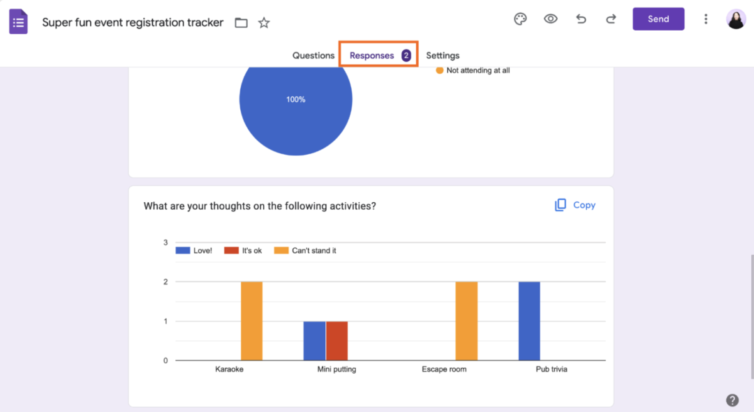
Google Forms
Source: Zapier
Best for quick analyses of short to medium surveys, especially ones with open-ended questions.
- View response breakdowns and summaries in the Summary tab
- Drill into individual results in the Questions tab
- Export everything to Google Sheets through Responses > Summary > More > Select destination for responses
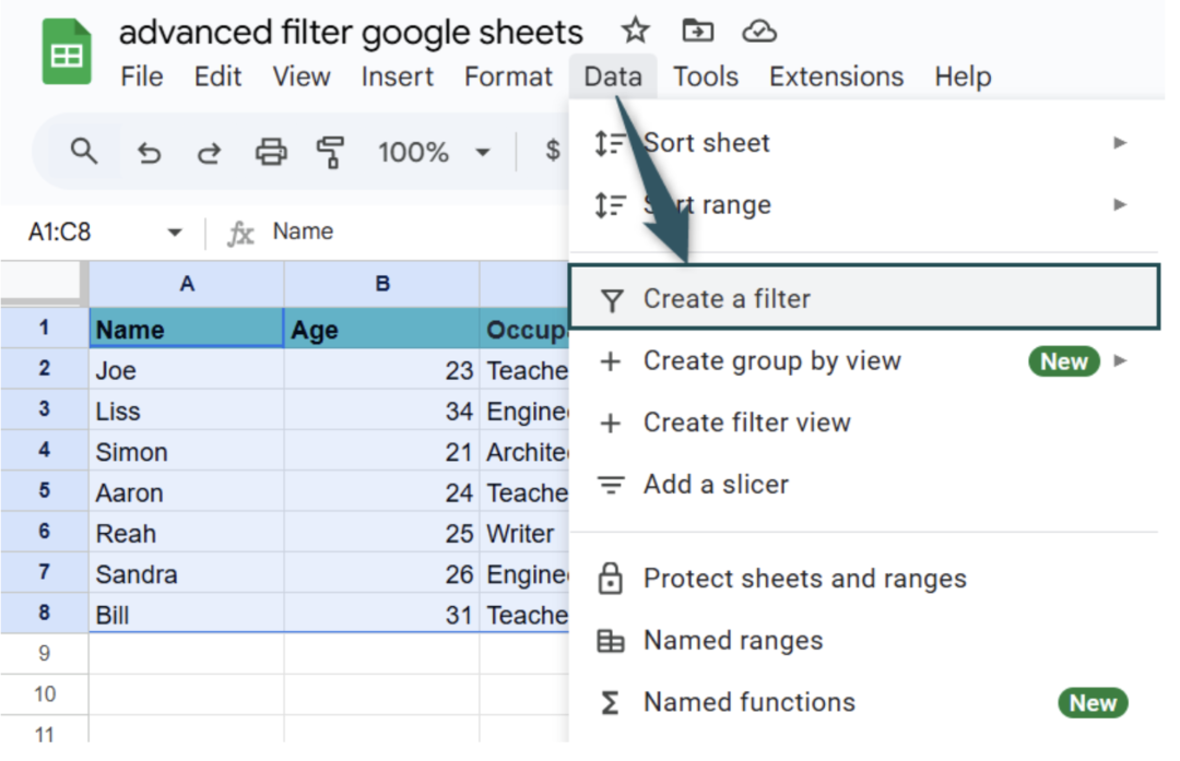
Google Sheets
Source: Excel Mojo
Best for quick analysis, data cleanup, and structuring raw responses.
Export your form results first, then set up your sheet so it’s easy to move through. Freeze the labels on row 1 with View > Freeze > 1 row, and add a filter through Data > Create a filter so you can reorder answers however you like.
From there, a few formulas do most of the work:
- =AVERAGE(B2:B100) for an average score like CSAT
- =COUNTIF(C2:C100, “Yes”) to count how often a specific answer appears
- =UNIQUE(D2:D100) to list every distinct response in a column
Swap the cell ranges for the ones you’re actually working with. To visualize, select your data range, then go to Insert > Chart and pick a column, line, or pie chart.
Microsoft Excel
Source: ExcelDemy
Best for deeper quantitative analysis.
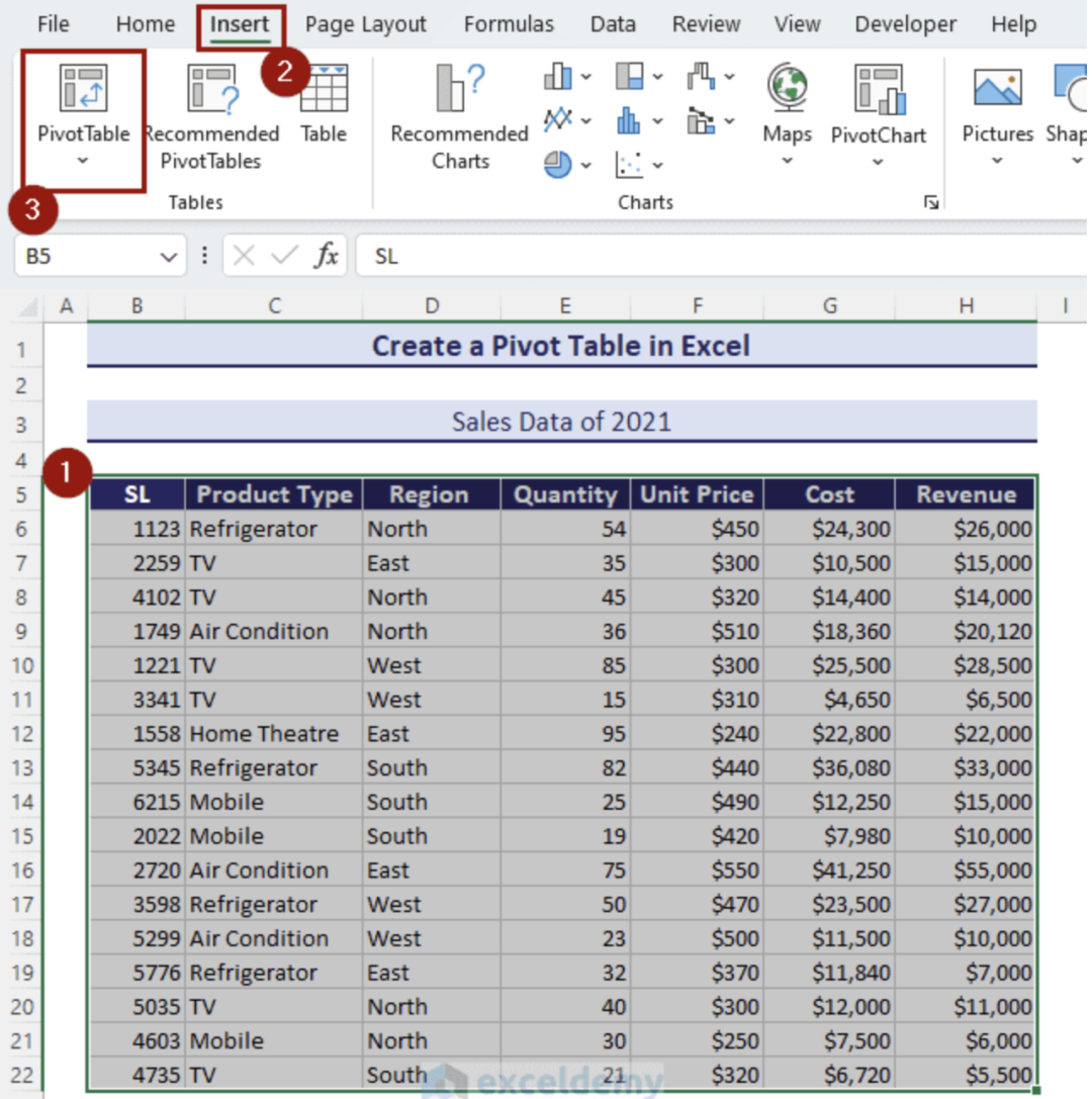
Export your survey data as a CSV and open it in Excel, then highlight the dataset and click Insert > Table to make it easier to filter. PivotTables are where Excel earns its place:
- Click anywhere inside your table
- Go to Insert > PivotTable, choose New Worksheet, and click OK
- Drag fields into the panel: the category to group by into Rows, an optional comparison group into Columns, and the metric you’re measuring into Values
Drop “Customer Type” into Rows and “CSAT Score” into Values, for example, to compare satisfaction between new and returning customers. Splitting one question by another like this is called a cross-tabulation, or crosstab, and it’s the quickest way to see how groups differ. Build a chart from the PivotTable through Insert > Chart, using bar or column charts for comparisons and line charts for trends. Simple formulas like =AVERAGE(range), =COUNTIF(range,”Yes”), and =SUMIF(range,criteria,sum_range) cover the rest.
ChatGPT/Claude/Copilot (other AI and LLM tools)
Source: ClickUp
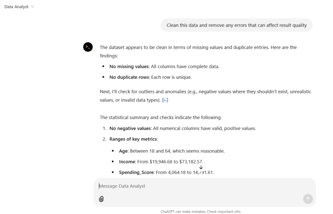
Best for qualitative work: summarizing large datasets and pulling insights out of open-ended responses.
Ask the tool to summarize key themes, run sentiment analysis by classifying responses as positive, neutral, or negative, and group answers into categories like pricing, shipping, or product quality. You can also ask for a shareable summary report or a quick chart. One caution: these tools speed up the reading, but you still make the call on what to do next.
The do’s and don’ts of survey data analysis
| Area | Do | Don’t |
|---|---|---|
| Organizing data | Segment your data before drawing conclusions, so real differences between groups surface | Treat every response as one big group and miss what sets segments apart |
| Analyzing data | Combine quantitative and qualitative data to see what’s happening and why | Lean only on scores without the open-ended feedback that explains them |
| Visuals | Use charts to make patterns easy to read and share | Rely on raw tables that bury the pattern |
| Segmenting customers | Break responses into meaningful groups like new versus returning, or by product type | Assume every customer has the same experience |
| Drawing conclusions | Look for patterns that repeat across questions and surveys | Draw a conclusion from one survey in isolation |
Turn survey data into better experiences with KNO
Survey data is only worth collecting if it changes what you do next. The strongest insights come from pairing the numbers with the written feedback behind them, so you can see what’s happening and why in the same view.
Want to do that at scale? Try KNO free for 7 days and put your responses to work.