
Most brands aren’t short on customer feedback opportunities. They’re short on customers willing to participate.
Survey fatigue is real, but the response problem usually isn’t fatigue. It’s survey design. The brands hitting 45%+ response rates and 90%+ completion rates aren’t lucky. They’ve made a series of deliberate calls about length, timing, channel, and question wording that respect the customer’s time. This is what those calls look like.
How long should your survey actually be
The honest answer to “how long should a questionnaire be” is: as long as it needs to be, and not a question longer.
Five to six questions is the comfortable default for post-purchase, and that’s where most brands on KnoCommerce land at around 90% completion. It’s the safe zone, short enough that customers don’t bail, long enough to capture attribution, satisfaction, and a follow-up. But the cap isn’t fixed. Oats Overnight is the proof. They run a 20-question post-purchase survey and still pull a 58% response rate with 77% completion. Customers will go that far when every question feels relevant. Length isn’t what breaks completion. Wasted questions are.
A few principles hold up across length. Every question needs to earn its spot, and if you can’t say what you’d do with the answer, cut it. Stack the high-value questions first so a drop-off at question four still leaves you with the data you came for. Show progress with a simple “2 of 5” cue or a progress bar, because customers go further when they can see the finish line. And watch completion rate, not question count. If completion falls below 85%, something’s off, and it’s usually relevance, not length.
Whether your survey needs a “design” at all
Post-purchase surveys live on the checkout confirmation page, which already has order details, shipping info, upsells, and tracking links competing for attention. Stacking a heavily designed survey on top of that, branded backgrounds, custom fonts, illustrations, mostly creates visual noise.
KnoCommerce surveys are intentionally minimal for that reason. Simple wins because the customer has already bought. They don’t need to be sold to or entertained. The goal is a clean answer, not a brand experience. Surveys aren’t quizzes.
That said, small design elements help when they make the question easier to answer. Image-based answer options work when visual recognition is faster than reading, like picking a creator or influencer for attribution, choosing a product variant, or identifying a packaging style. Logos next to channel options on attribution questions (TikTok, Instagram, YouTube) let customers scan instead of read. Emoji or icon-based rating scales can work when a Likert scale feels too clinical.
The rule of thumb: design should make the question easier to answer, not prettier to look at. If a design element doesn’t reduce friction or speed up the response, it’s working against you.
Mixing open-ended and closed-ended questions for better data
The question format should follow the data you need. Lead with closed-ended questions to lower the activation cost, then layer in open-ended questions where you need the story behind the number. Both have a job, and the order matters.
Closed-ended questions
Closed-ended questions, multiple-choice, Y/N, rating scales, are best for data you need to compare at scale: attribution, satisfaction scores, demographics, purchase frequency. They’re fast to answer, easy to segment, and easy to trend over time. They’re also the right way to open a survey, because tapping a button takes less effort than typing. They’re the workhorse of most survey research because they produce clean, comparable data quality across thousands of responses.
A few things to get right when you write them. Lead the survey with one to lower the activation cost. Keep answer options mutually exclusive, because overlapping options muddy the data. Always include the obvious answer, because forcing a workaround response biases the result. Update options as your channel mix or product line evolves, adding new attribution sources and retiring dead ones. And cap answer options at five to seven where possible, since longer lists slow customers down on mobile.
Open-ended questions
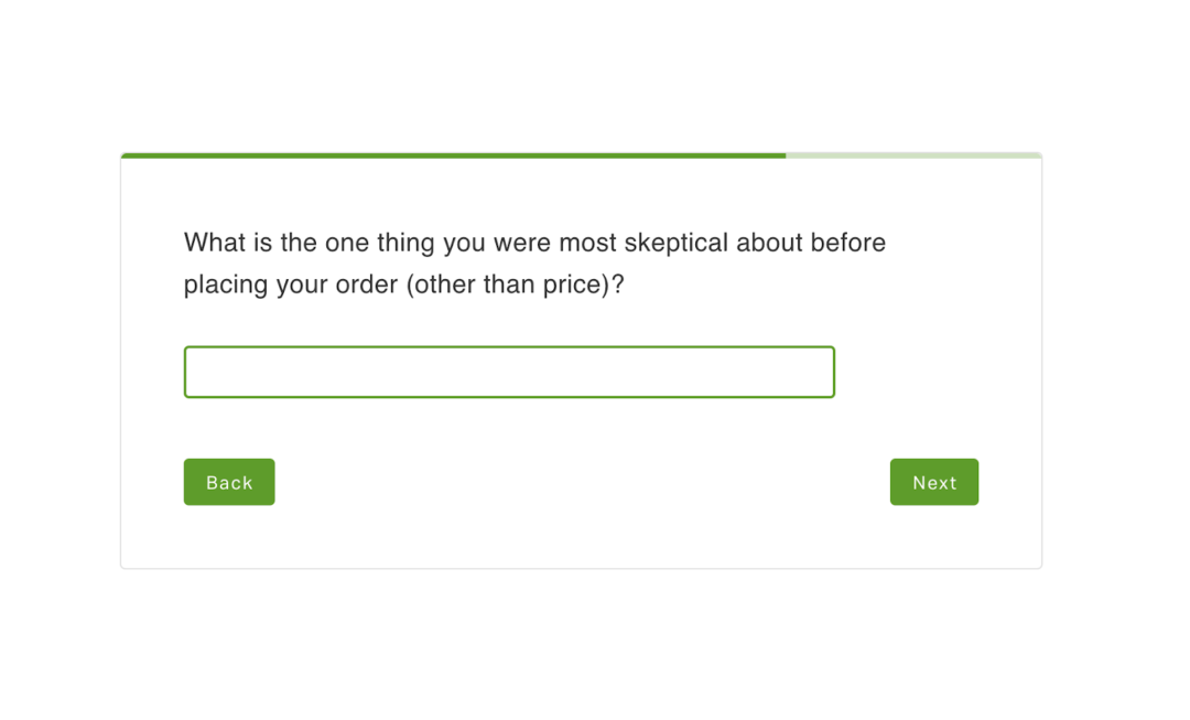
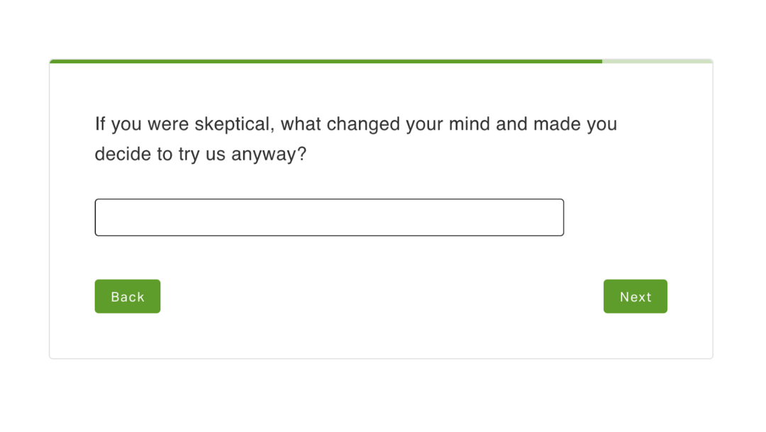
Open-ended questions capture the texture closed-ended can’t: friction points, motivation, the language customers actually use. A well-placed one gives you sentences you can lift straight into ad copy and landing pages. One open-ended question outperforms three, every time.
Place them as follow-ups or near the end of the survey, never as question one. Be specific in the prompt, since “What nearly stopped you from buying?” outperforms “Any other feedback?” Use them to dig into a closed-ended response, like an NPS score followed by “What’s the primary reason for your score?” Keep it to one per survey unless you have a clear reason to ask more. Open-ended responses double as ad copy and landing page language, because customers tell you how to sell to them.
Writing questions that don’t bias the answer
Leading questions and double-barreled questions break the data before you’ve collected it.
“How much did you love our new product?” is leading. “What did you think of our new product?” is neutral. The framing is the difference between an honest signal and a flattering one. Same goes for “Was checkout fast and easy?” That’s a classic double-barreled question. If checkout was fast but confusing, there’s no honest way to answer. Split it into two.
Loaded multiple-choice is the quieter version of the same problem. If your answer options skip the most likely real response, you force customers into something that isn’t true, and the data looks clean even though it isn’t. Test every question by asking: could a dissatisfied customer answer honestly here? If not, rewrite it. Cleaner questions lead to cleaner data, which leads to clearer decisions.
The best time to send a customer survey
Timing depends on what you’re measuring, and the closer the question sits to the moment that triggered it, the clearer the response.
Attribution and CRO questions belong immediately post-purchase, when memory is freshest. Product feedback on CPG, digital, and low AOV products lands best 7 to 14 days post-delivery, after customers have used the product but before they’ve forgotten the purchase. High AOV and considered purchases need more room: push to 45 to 60 days post-delivery so the real experience has time to form. Customer support follow-ups work same-day, while the interaction is still concrete. And milestone surveys at the 5th order, 10th order, or anniversary pull retention signal no transactional survey can.
Random timing produces random data. Customers can tell when a survey was sent because it was Tuesday, not because something happened worth asking about.
Choosing the right channel: email, SMS, on-site, QR, and popups
The strongest survey programs combine two or three channels, not all of them. Each channel has a different mindset attached to it, and matching the question to the mindset is what lifts response quality. It’s worth noting that not all survey platforms handle every channel equally, and the limitations of your tool often shape what’s actually possible.
The post-purchase page has the highest response rates by a wide margin, and it’s the best home for attribution and quick CRO questions because the customer is already on your site and engaged. Email is stronger for longer or follow-up surveys, and embedding the first question directly in the email cuts friction. SMS works for short, single-question check-ins to engaged customers, because mobile-first audiences respond fast but the format only fits short asks. QR codes are underused, and they fit packaging, inserts, and unboxing because the customer is already physically interacting with your product. Website popups and web surveys belong only at high-intent moments like cart abandonment or post-purchase confirmation, because they erode trust everywhere else.
A multi-channel program doesn’t mean sending the same survey through five places. It means picking the channel that fits the question.
Should you offer an incentive for completing a survey?
The instinct to add a discount or freebie usually doesn’t move the needle the way brands expect, and it can quietly distort the data you came for.
A well-designed, well-timed survey earns the response on its own. Incentives can introduce bias on attribution or NPS surveys, where customers answering for the discount break the metric you were trying to measure. It’s the same reason researchers running focus groups have to think carefully about compensation: pay too much and people tell you what they think you want to hear. Where incentives help: long research surveys (20+ questions), low-engagement segments, win-back audiences. Keep any incentive small enough not to reframe the survey as a transaction. If response rates are low, the answer is usually a design fix, not a discount.
A better use of that real estate: the post-survey CTA
The post-survey screen is the most underused piece of real estate in ecommerce.
Across 322 active brands and 978K shopper impressions in the last 30 days, KnoCommerce surveys carried CTAs for loyalty enrollment, refer-a-friend, app downloads, social follows, and discount reveals. Social Follow is the most-adopted action, running on 57% of brands, but it’s not the highest-converting. Loyalty/Rewards drives a 24% CTR and Discount Code reveals drive 20%, both outperforming Social Follow’s 17% when brands actually configure them.
The bigger finding: 66% of brands run exactly one CTA, and 20% run zero, using the survey as a thank-you screen with no action attached. Only 14% stack two or more. Most brands aren’t structuring this moment at all.
Picking the actions that actually convert
Loyalty/Rewards (24% CTR) and Refer-a-Friend (11% CTR) outperform Social Follow when actually configured. Within any single action type, top-quartile brands convert 2 to 4x the median. For Social Follow, the median CTR is 11% and top performers clear 45%. The gap isn’t the action itself. It’s how intentionally it’s built.
Swim Outlet uses their post-survey screen to drive referrals with a direct “Refer a Friend” CTA, prompting buyers to share with friends and family immediately after completing the survey.
Stacking multiple CTAs in one screen
86% of brands run one CTA or fewer. A single low-CTR action is the default setup, not the optimized one. The survey screen supports multiple CTAs without adding friction, and the brands running two or more consistently pull higher-converting action types.
BYLT Basics runs three actions in a single survey screen, giving buyers multiple ways to engage in one flow.
The takeaway: instead of paying for the response with a discount up front, design the survey so the response itself opens a higher-converting moment on the way out.
Designing surveys that work on mobile
Most post-purchase responses happen on mobile. If the survey isn’t tap-friendly, response rates fall before the first question. A survey that’s clean on desktop and clunky on mobile loses the majority of its potential responses before question one.
Tap targets should be sized for thumbs, not cursors. Keep it to one question per mobile screen, because scrolling kills momentum. Lead with closed-ended questions to lower the typing barrier. Check that rating scales render cleanly on a small screen, because a five-point scale that wraps to two lines loses customers fast. And test on your own phone before launch, in the time you’d give a stranger’s survey.
Collecting feedback without burning out your customers
The customers who answer this survey are the ones who’ll answer the next one, but only if you treat their response like it mattered.
Cap frequency at one survey per 30 to 45 days unless there’s a fresh interaction worth asking about. Segment so each customer gets the right survey, not every survey: new vs. returning, high vs. low LTV, product category. Then route responses to action. Promoters go to referral flows. Detractors go to CX. Product complaints go to the product team. Customers can tell when their answer disappeared into a void, and they stop participating.
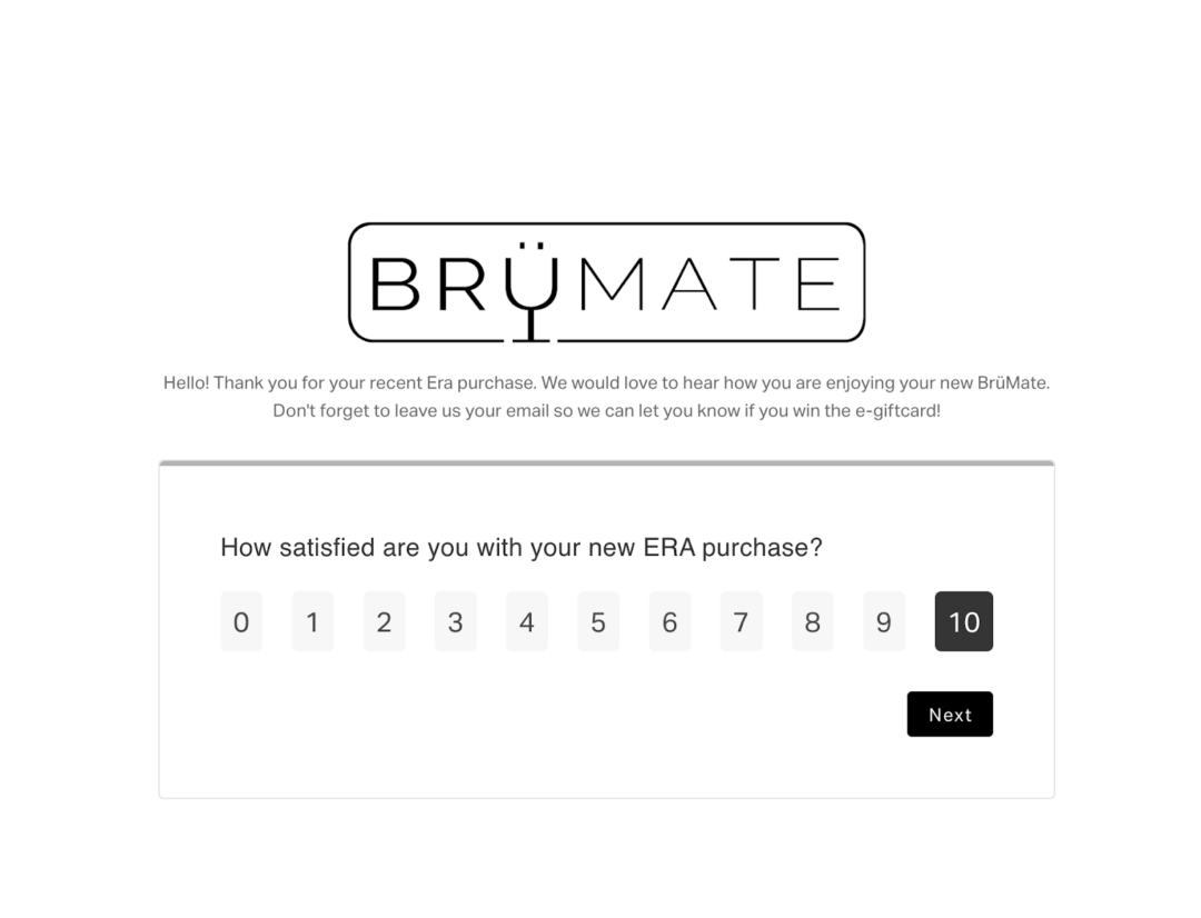
BrüMate’s post-purchase surveys hit a 98% response rate and 96% completion rate. They didn’t get there by sending more surveys. They got there by building a program where every survey had a clear job and the responses fed directly into how they marketed, supported, and developed product.
Better surveys, better answers
Survey design is a series of small calls: length, timing, channel, phrasing, follow-up. Each one is reasonable on its own. Together they decide whether a customer answers question one or closes the tab.
The brands with the cleanest data aren’t sending more surveys. They’re sending surveys that earn the response.
See what your customers will tell you when the survey is built to be answered
With KnoCommerce, ecommerce brands design surveys customers actually finish. Over 30 templates for attribution, NPS, CSAT, and product feedback, conditional logic that adapts to each respondent, and direct sync to Klaviyo, Shopify Flow, and Triple Whale so responses trigger action instead of sitting in a dashboard.
Book a demo to see how.